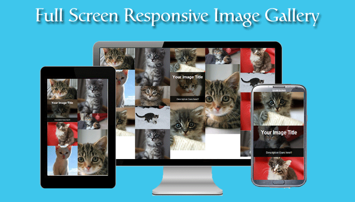
How to create a full-screen responsive image gallery using CSS and Masonry ( is a JavaScript grid layout library ), Masonry gallery is a popular grid layout that uses optimal space to place images without the need to crop your pictures. We are giving you this tutorial with a nice demo and source to download for free.
Step 1:
Create a grid and add images with different sizes.
<div id="container">

    <div class="grid-sizer"></div>

    <div class="item">

        <img src="http://placekitten.com/650/450" class="image">

        <a class="onhandover" href="#">

            <h3 class="title">Your Image Title</h3>

            <div class="description">

                <p>

                    Description Goes here!!

                </p>

            </div>

        </a>

    </div>

    <div class="item">

        <img src="http://placekitten.com/650/750" class="image">

        <a class="onhandover" href="#">

            <h3 class="title">Your Image Title</h3>

            <div class="description">

                <p>

                    Description Goes here!!

                </p>

            </div>

        </a>

    </div>

    <div class="item">

        <img src="http://placekitten.com/1650/1250" class="image">

        <a class="onhandover" href="#">

            <h3 class="title">Your Image Title</h3>

            <div class="description">

                <p>

                    Description Goes here!!

                </p>

            </div>

        </a>

    </div>

    <div class="item">

        <img src="http://placekitten.com/850/450" class="image">

        <a class="onhandover" href="#">

            <h3 class="title">Your Image Title</h3>

            <div class="description">

                <p>

                    Description Goes here!!

                </p>

            </div>

        </a>

    </div>

    <div class="item">

        <img src="http://placekitten.com/900/700" class="image">

        <a class="onhandover" href="#">

            <h3 class="title">Your Image Title</h3>

            <div class="description">

                <p>

                    Description Goes here!!

                </p>

            </div>

        </a>

    </div>

    <div class="item">

        <img src="http://placekitten.com/700/1400" class="image">

        <a class="onhandover" href="#">

            <h3 class="title">Your Image Title</h3>

            <div class="description">

                <p>

                    Description Goes here!!

                </p>

            </div>

        </a>

    </div>

    <div class="item">

        <img src="http://placekitten.com/1200/1300" class="image">

        <a class="onhandover" href="#">

            <h3 class="title">Your Image Title</h3>

            <div class="description">

                <p>

                    Description Goes here!!

                </p>

            </div>

        </a>

    </div>

    <div class="item">

        <img src="http://placekitten.com/750/650" class="image">

        <a class="onhandover" href="#">

            <h3 class="title">Your Image Title</h3>

            <div class="description">

                <p>

                    Description Goes here!!

                </p>

            </div>

        </a>

    </div>

    <div class="item">

        <img src="http://placekitten.com/1600/900" class="image">

        <a class="onhandover" href="#">

            <h3 class="title">Your Image Title</h3>

            <div class="description">

                <p>

                    Description Goes here!!

                </p>

            </div>

        </a>

    </div>

    <div class="item">

        <img src="http://placekitten.com/700/400" class="image">

        <a class="onhandover" href="#">

            <h3 class="title">Your Image Title</h3>

            <div class="description">

                <p>

                    Description Goes here!!

                </p>

            </div>

        </a>

    </div>

    <div class="item">

        <img src="http://placekitten.com/1100/1200" class="image">

        <a class="onhandover" href="#">

            <h3 class="title">Your Image Title</h3>

            <div class="description">

                <p>

                    Description Goes here!!

                </p>

            </div>

        </a>

    </div>

    <div class="item">

        <img src="http://placekitten.com/800/1100" class="image">

        <a class="onhandover" href="#">

            <h3 class="title">Your Image Title</h3>

            <div class="description">

                <p>

                    Description Goes here!!

                </p>

            </div>

        </a>

    </div>

    <div class="item">

        <img src="http://placekitten.com/600/400" class="image">

        <a class="onhandover" href="#">

            <h3 class="title">Your Image Title</h3>

            <div class="description">

                <p>

                    Description Goes here!!

                </p>

            </div>

        </a>

    </div>

    <div class="item">

        <img src="http://placekitten.com/1100/900" class="image">

        <a class="onhandover" href="#">

            <h3 class="title">Your Image Title</h3>

            <div class="description">

                <p>

                    Description Goes here!!

                </p>

            </div>

        </a>

    </div>

    <div class="item">

        <img src="http://placekitten.com/1320/1200" class="image">

        <a class="onhandover" href="#">

            <h3 class="title">Your Image Title</h3>

            <div class="description">

                <p>

                    Description Goes here!!

                </p>

            </div>

        </a>

    </div>

    <div class="item">

        <img src="http://placekitten.com/1024/768" class="image">

        <a class="onhandover" href="#">

            <h3 class="title">Your Image Title</h3>

            <div class="description">

                <p>

                    Description Goes here!!

                </p>

            </div>

        </a>

    </div>

</div>
The above markup creates an image grid with title and description with images placeholder for fast images delivery http://placekitten.com/1024/768 placekitten.com is A quick and simple service for getting pictures of kittens for use as placeholders in your designs or code.
CSS to organize your gallery:
<style>

.item {

    float: left;

    position: relative;

    line-height: 1em;

}


.grid-sizer { width: 20%; }

.item { width: 20%; }


@media screen and (max-width: 1224px) {

  /* 10 columns for larger screens */

  .grid-sizer { width: 33.33%; }

  .item { width: 33.33%; }

}


@media screen and (max-width: 720px) {

  /* 10 columns for larger screens */

  .grid-sizer { width: 50%; }

  .item { width: 50%; }

}


@media screen and (max-width: 480px) {

  /* 10 columns for larger screens */

  .grid-sizer { width: 100%; }

  .item { width: 100%; }

}


.image{

    max-width: 100%;

    margin: 0;

    display: block;

}


.image:after {

    clear:both;

}


.onhandover {

    width: 100%;

    height: 100%;

    background-color: rgba(0,0,0,0.5);

    position: absolute;

    top: 0;

    left: 0;

    text-decoration: none;

    color: #fff;

    display: none;

}


.onhandover .title {

    text-align: center;

    font-size: 30px;

}


.onhandover .description {

    position: absolute;

    bottom: 0;

    left: 0;

    background-color: rgba(0,0,0,0.80);

    width: 100%;

    margin: 0;

}


.onhandover .description p {

    text-align: center;

}


.item:hover .onhandover {

    display: block;

}

.item h3 {

    margin: 20px;

}

.item p {

    margin: 10px;

}

</style>
We used @media for different screens to make the gallery responsive and .onhandover class to show the title and description oh the handover event.
jQuery files to Include:
<script type="text/javascript" src="jquery-1.8.0.min.js"></script>

<script type="text/javascript" src="masonry.pkgd.min.js"></script>
Initialize Masonry using the following:
<script type="text/javascript">

$(window).load( function() {


    $("#container").masonry({

        "itemSelector": ".item",

        "columnWidth": ".grid-sizer",

    });


});

</script>
That’s all for today’s tutorial. I hope you like this tutorial. Please don’t forget to give us your feedback and share it with your friends.

1 Comment
How to Create Full Screen Responsive Image Gallery Using CSS and Masonry – A2M1N
October 8, 2020 at 8:27 am[…] Article URL: https://www.phplift.net/how-to-create-full-screen-responsive-image-gallery-using-css-and-masonry/ […]